UI Components
ListView
UI component for rendering large lists using view recycling, with optional sticky headers, sectioned data, and an integrated search bar.
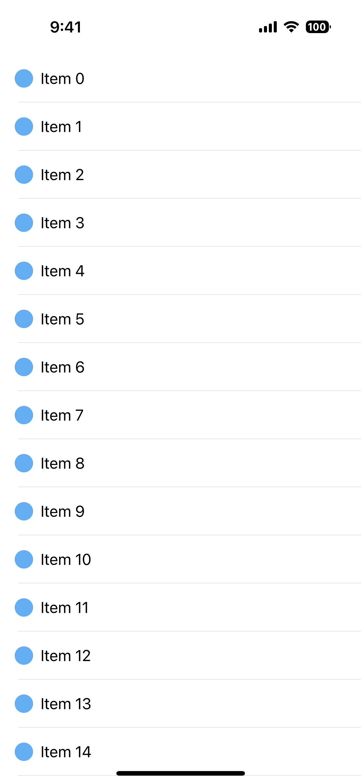
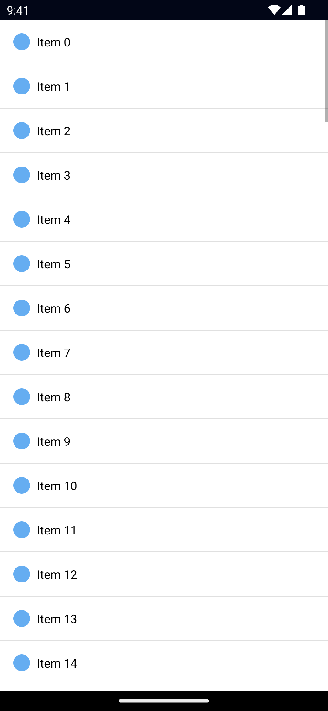
<ListView> is a UI component that renders items in a vertically scrolling list. The template for the items can be defined via itemTemplate (or multiple templates via itemTemplates — more on that below). The ListView only renders the visible items; as the user scrolls, new items render by reusing a no-longer-visible item's view — this is usually referred to as view-recycling.
Newer versions of ListView (v9+) can also render sectioned data (for example, A–Z lists) with sticky headers and an optional search bar that can auto-hide on iOS.
TIP
You can also explore CollectionView from the community.
Examples
ListView with multiple itemTemplates
Individual items can be rendered using a different template. For example, let's say our items can either be headings or items. In that case, we can define a template for them, and pass in an itemTemplateSelector function that will get called before rendering an item.
Sectioned ListView with sticky headers and search
Starting with v9, ListView can render sectioned data with sticky headers and an optional search bar. This is useful for contact lists, country lists, or any data grouped by a key.
A supported data shape looks like this:
const countries: { title: string; items: { name: string; code?: string; flag?: string }[] }[] = [
  {
    title: 'A',
    items: [
      { name: 'Albania', code: 'AL' },
    ],
  },
  {
    title: 'B',
    items: [
      { name: 'Bahamas', code: 'BS' },
    ],
  },
]
You can then bind this data to the ListView and enable the new props:
<ListView
  items="{{ countries }}"
  sectioned="true"
  stickyHeader="true"
  stickyHeaderHeight="45"
  stickyHeaderTopPadding="false"
  showSearch="true"
  searchAutoHide="true"
  itemTemplateSelector="{{ itemTemplateSelector }}"
  stickyHeaderTemplate="
    <GridLayout>
      <Label text='{{ title }}'
             fontSize='18'
             fontWeight='bold'
             color='#009bff'
             padding='8 0 8 12'
             borderBottomWidth='1'
             borderBottomColor='#ccc'
             borderTopWidth='1'
             borderTopColor='#ccc'
             backgroundColor='#fff' />
    </GridLayout>
  " />
In code you can listen for search changes:
listView.on('searchChange', (args: SearchEventData) => {
  console.log('search text:', args.text)
  // apply filtering to your backing data if desired
})
Notes:
searchAutoHideis currently iOS-only (it will auto-hide the search on scroll).stickyHeaderTemplateaccepts the same binding context as the section (title, etc.).- Make sure each section’s
itemsarray is present; empty / null sections may not render as expected.
Props
items
items: Array | ObservableArrayGets or set the items of the ListView.
For static lists using an Array is fine, however for dynamically changed arrays it's recommended to use an ObservableArray to optimize re-rendering performance.
See ObservableArray.
itemTemplateSelector
itemTemplateSelector: (
  item: T,
  index: number,
  items: Array | ObservableArray,
) => string
A function to be called when selecting the template for the item.
itemTemplate
itemTemplate: KeyedTemplateGets or sets the default item template.
Note: this is usually set by the framwork (eg. ListView.itemTemplate via xml).
See KeyedTemplate.
itemTemplates
itemTemplates: KeyedTemplate[]Gets or sets the available itemTemplates.
Note: this is usually set by the framwork (eg. ListView.itemTemplates via xml).
See KeyedTemplate.
sectioned
sectioned: booleanEnables sectioned data rendering on the ListView. When true, the ListView expects the items source to be an array of sections where each section has a title (or similar field) and an items array:
{
  title: string;
  items: any[];
}
This allows the ListView to render grouped lists with headers.
stickyHeader
stickyHeader: booleanEnables sticky (pinned) headers while scrolling sectioned data. When enabled, the current section header stays at the top of the list until the next section header pushes it away.
stickyHeaderTemplate
stickyHeaderTemplate: string | KeyedTemplateGets or sets the template used to render a section header when sticky headers are enabled. This accepts bindings from the current section (for example: ).
stickyHeaderHeight
stickyHeaderHeight: numberExplicit height for the sticky header. Providing this can improve measurement and scrolling performance, especially on iOS where headers update as you scroll.
stickyHeaderTopPadding
stickyHeaderTopPadding: boolean | numberControls the padding applied to the sticky header at the top. Set to false to disable the extra top padding; set to a number to supply an explicit padding value.
showSearch
showSearch: booleanShows a built-in search bar above the ListView. This is useful when you want a declarative, per-list search input without adding a separate SearchBar component.
searchAutoHide
searchAutoHide: boolean(iOS only) When true, the built-in search bar will auto-hide when the user scrolls. This mirrors common iOS list behaviors.
separatorColor
separatorColor: ColorGets or sets the color of the line separating each item.
TIP
Set the separatorColor to transparent to hide it, or use your own borders.
See Color.
rowHeight
rowHeight: numberGets or sets the row height of the ListView. Useful when your items have a fixed height, as the required calculations are greatly simplified and the rendering can be faster.
Android: with the latest ListView improvements, row items will now react properly to spacing (padding and margin), so setting
rowHeightalongside your layout spacing should behave more predictably across platforms.
iosEstimatedRowHeight
Gets or sets the estimated height of rows in the ListView. Default value: 44px
...Inherited
For additional inherited properties, refer to the API Reference.
Methods
refresh()
listView.refresh()Forces the ListView to reload all its items.
scrollToIndex()
listView.scrollToIndex(index: number)Scrolls the item with the specified index into view.
scrollToIndexAnimated()
listView.scrollToIndexAnimated(index: number)Scrolls the item with the specified index into view with animation.
isItemAtIndexVisible()
listView.isItemAtIndexVisible(index: number) // booleanChecks if the item with the specified index is visible.
Events
itemTap
on('itemTap', (args: ItemEventData) => {
  const listView = args.object as ListView
  console.log('Tapped index', args.index)
  console.log('Tapped item', listView.items[args.index])
})
Emitted when a user taps an item in the ListView.
See ItemEventData.
itemLoading
on('itemLoading', (args: ItemEventData) => {
  const listView = args.object as ListView
})
Emitted when the ListView is loading/recycling an item. args.view is set if the ListView is recycling an item, otherwise it's undefined.
Note: frameworks use this event to update the args.view with new data.
See ItemEventData.
loadMoreItems
on('loadMoreItems', (args: EventData) => {
  const listView = args.object as ListView

  // example: add new items
  listView.items.push(newItems)
})
Emitted when the user reaches the end of the ListView. Useful for loading additional items (ie. infinite scroll).
searchChange
on('searchChange', (args: SearchEventData) => {
  console.log('Search text changed:', args.text)
})
Emitted when the built-in search bar text changes. You can use this to filter the underlying list data, or to drive remote searches.
See SearchEventData in the API reference for the shape of the event.
Native component
- Android:
android.widget.ListView - iOS:
UITableView
- Previous
- ListPicker
- Next
- Placeholder


